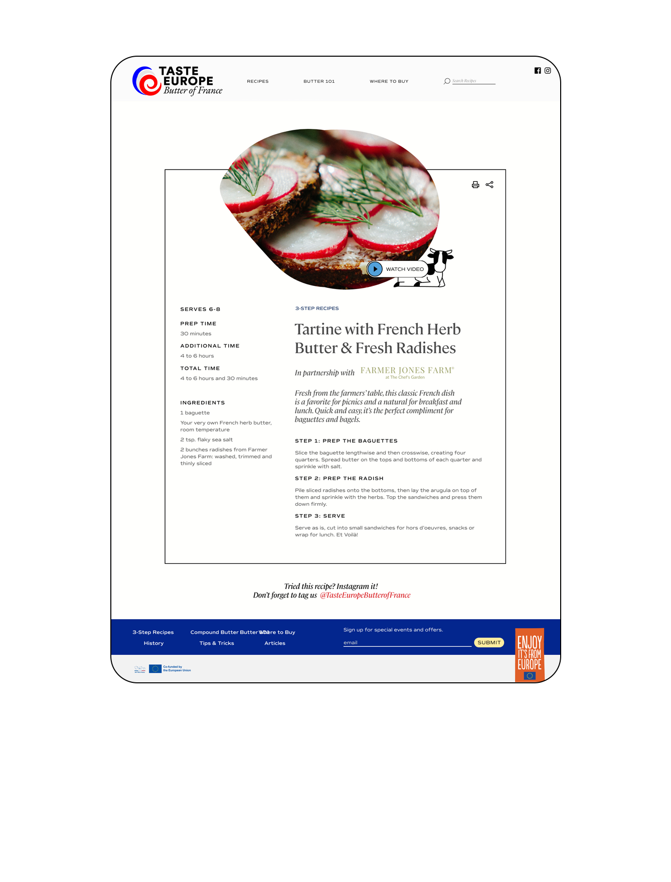
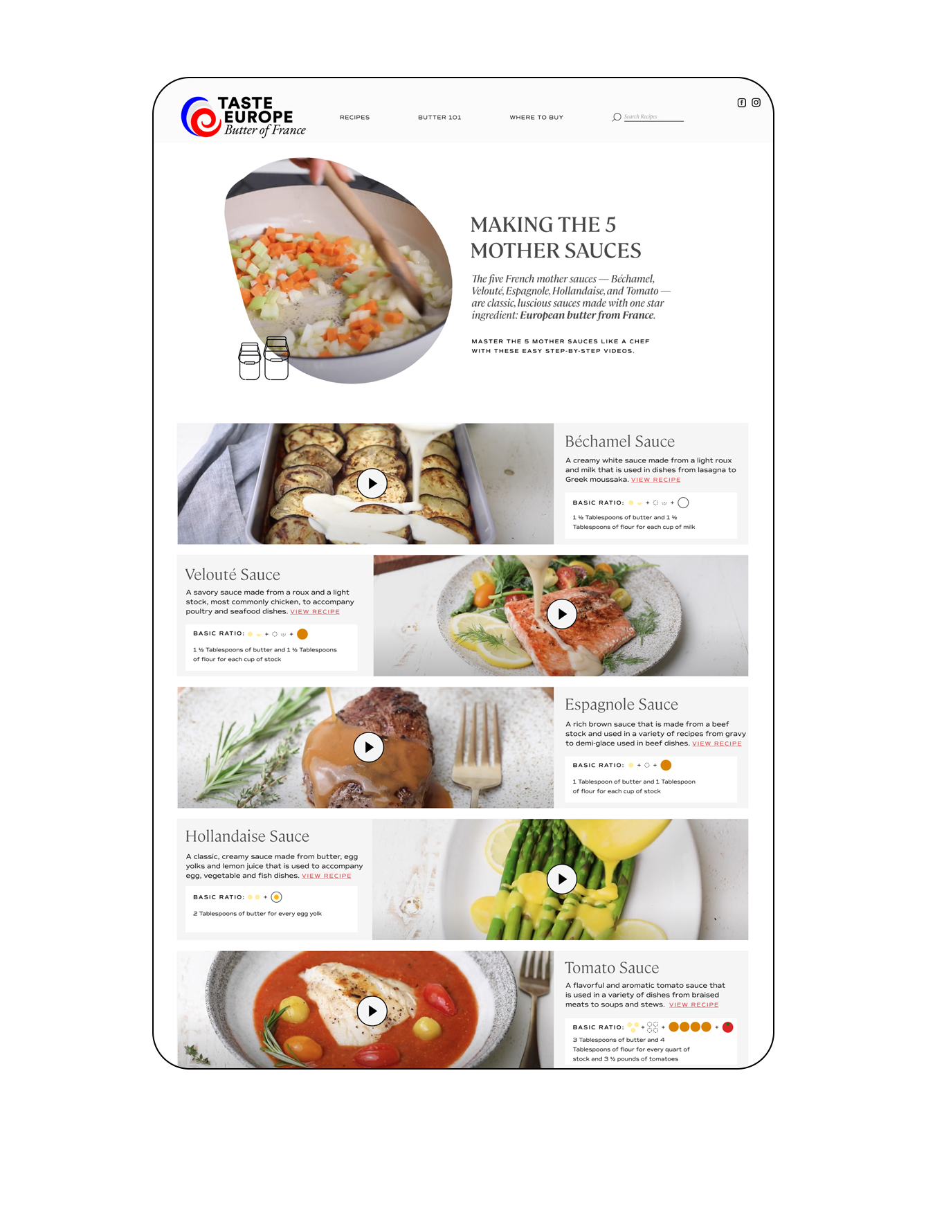
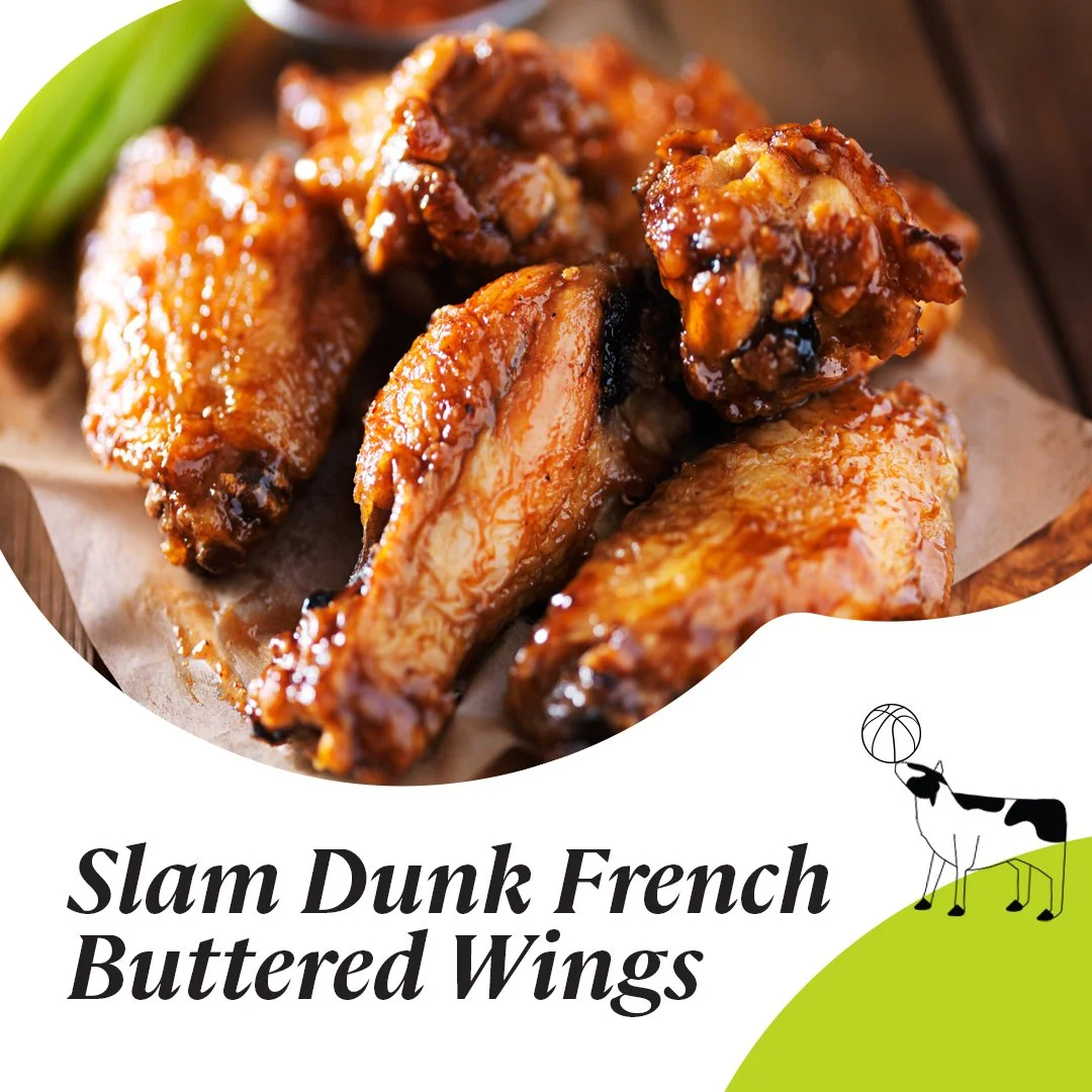
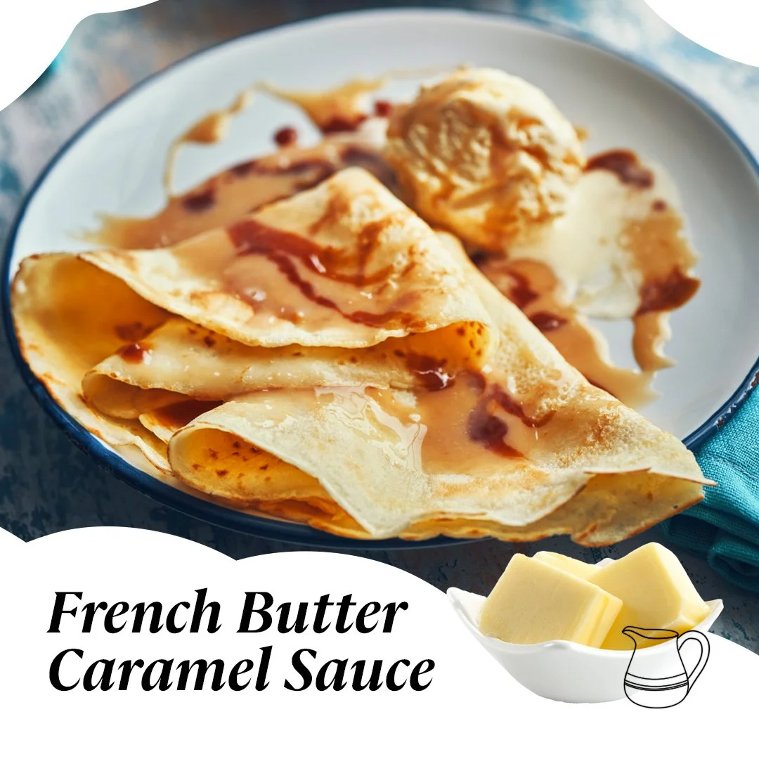
Butter of France needed a new logo identity, branding and site to market their European butter companies and recipes. Inspired by the curl of a rolling wave of butter, I created a logo in the colors of the French flag–well, red, blue and silver–and based the header image shape off a melting smear of butter, with lineart for the site provided by my coworker Joanna and typefaces provided by my coworker Dawn.
I continue to add recipes to the site on a regular basis, along with creating newsletters, social posts and stories.


